 This is a Gucci event invitation which is very straight forward and boring, with it only being a standard common shape and one colour this is unlikely to attract anyone's' attention. It has the name of the designer straight at the top because this is likely to be the only thing that draws you into the event because the rest of the invitation is just plain and straight forward only consisting of a large amount of information.
 This is a completely different leaflet look but still uses the flat 2D rectangle shape as the Gucci invite, however this one has a picture to draw you in, with the face pointing towards the writing make your eyes follow where the woman in looking causing you to look at the text on the right. Although this one only uses three main colours (white, black, purple) it still attracts your attention a lot more compared to the first advert, but it still keeps the professional look.
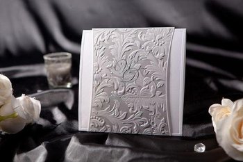
 These are two invitations that would link to my collaboration style, with my embossed textures and patterns being used in the invite making it more unusual for someone when opening it and looking at it, with a different style and look compared to many invitations, however it still linking back to the collection and summing it up as a whole
.
 This is a 3D invitation that unfolds as you open it, this is very elegant and classy and will show what the event may be like. The colours are simple but still draw you in to look, and even though the main focus is on the bird cage there is still room for all the information about the event.

 This is a leaf based swing tag which uses different textures such as paper and fabric. I want to incorporate different textures through my log and swing tag like this how ever all on one piece of card instead of using two like this one above.
 Although from the shadow you can tell the sections in the middle have been cut out I like the way the actual leaf looks embossed with the markings all raised about, making it interesting to feel as well as to look at. This is the idea I want for my own leaves on my tree and my swing tag because it will give the customers something to interact with and to feel. I would also use different textures and patterns on the leaves that link to the environment for example snake print or stripes from animals which would link to the graphic T-shirts of the collaboration.

 These are two sculptures that are creative and arent made to look exactly like a tree which I think would work well in the fashion industry with them being a bit abstract. If I was to make a sculpture like this I would use recycled materials to link to the environmentally friendly theme. Although I think this would look good I do not think I would have the right materials and the skills to make this look effective and realistic.
 I really like this photographs of leaves hanging from the trees and it has made me think about not attaching the leaves to a model of a tree but to hang them and around them to create this falling look, linking to my autumn/winter collection.


